Hansel: Travel Blogging Mobile App

Skills Applied

Research | Usability Testing | UI Design

Softwares Used

Maze | Figma | FigJam | Miro

User Base

Avid Travelers | Travel Bloggers

Industry Experience

Travel | Blogging

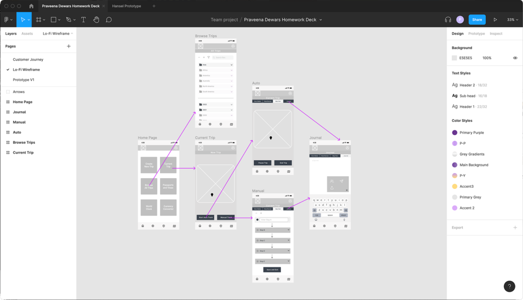
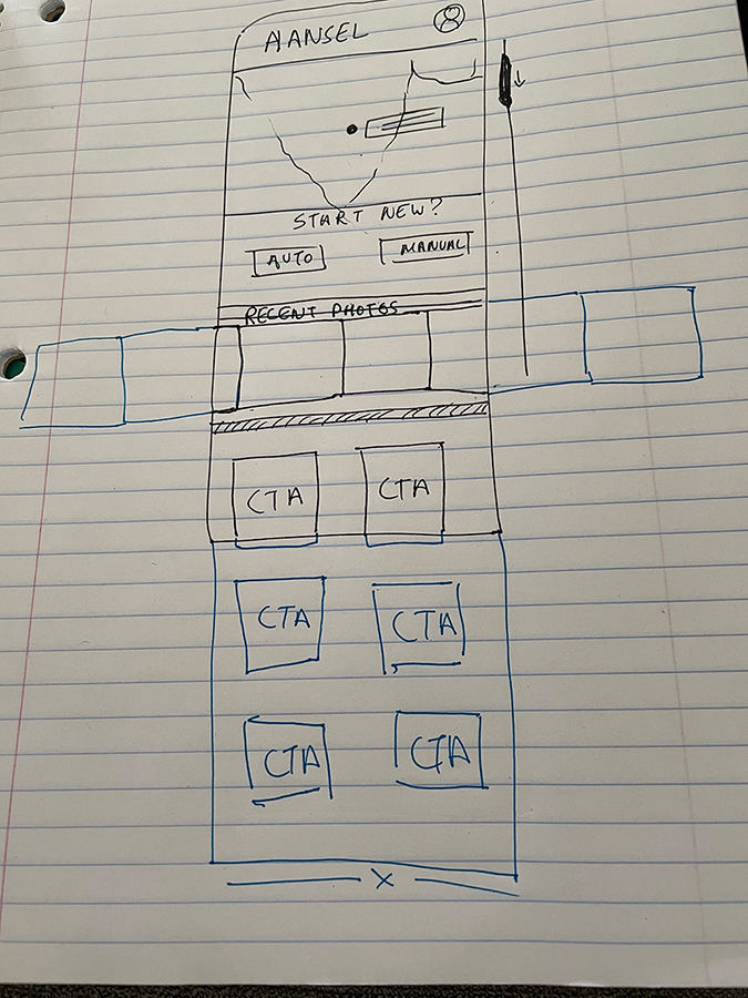
Hansel App — Personal Project

A self-initiated passion project I created while exploring new ways to apply my UX skills. At the time, I wanted to push myself beyond client briefs and practice the full end-to-end product process — from research and wireframing to prototyping and visual design.

The goal wasn’t launch or revenue; it was about learning by doing. Through Hansel, I sharpened my ability to:

• Translate a personal need into a product concept

• Run lightweight research and sketch flows quickly

• Test out design patterns in Figma

• Build confidence in taking an idea from 0→1 independently

Executive Summary

Hansel began as a personal learning project where I wanted to explore the full end-to-end UX process outside of client work. I conducted lightweight user research to establish personas and map customer journeys, then used these insights to frame the problem statement: How might we provide avid travelers with mobile travel journaling?

I benchmarked existing apps through competitor analysis, translated early sketches into low-fidelity wireframes, and iterated into a high-fidelity prototype in Figma. To validate the design, I ran usability tests that helped refine the experience and ensure it felt intuitive for travelers.

What is Hansel?

Hansel is a handy little travel companion that:

  • Stores your trip routes
  • Allows location specific journal entries
  • Personal ratings/reviews
  • Media gallery

What was the outcome of this project?

Hansel was never intended for release — it was a practice project to strengthen my UX craft. The outcome was a polished prototype and a deeper understanding of how to take an idea from research → design → testing independently.


User Research: Interviews and Affinity Mapping

The goal of my test plan was to find out travel journaling habits amongst avid travelers – why they use what they use and how they use it. I then synthesized this data for qualitative insights, following which hypotheses began to form. These theories required quantitative data to support them – or disprove them, if incorrect.

Using Miro, I organized data collected from 5 user interviews.


Competitor Analysis

It became clear who my competition is, and, which features I would need to prioritize if I’m going to give them a run for their money.


Persona & Flows

This led me to my user persona, Rowland Stone: an avid traveller scouring the earth for his next big business venture. A true rolling stone in need of a no-fuss, digitized travel journal so he can share experiences with friends & family back home.

I then ran a task analysis on the 3 must-have features: Location Tracking, Journalling and Sharing and created user flows for the app I was still just envisioning.


Wireframes

Following some sketches, I put together a wireframe (Figma) – my visual reference for building a prototype.


Usability Testing & Heat Maps

During usability testing, I was able to identify key areas of improvement in the initial UI. After one more round of moderated testing, I discovered users now encountered an entirely different set of problems.

It was time to bring out the big guns. Using Maze, I had an in-depth view of user frustrations.

I paired qualitative data (user heat-maps and feedback) with quantitative data (success rates, misclick rates, average time and usability scores).

Next Steps

Lo-Fidelity Wireframes

My last Usability Test went almost flawlessly. However, I found that users had a 4+ click rate per task, and I need to factor in the 3-click rule per User Research – back to the ol’ drawing board!

Key Takeaways

  • User interpretations of iconography can vary – labeling CTA’s is crucial
  • Users want things NOW – shorter paths ensure better retention rates
  • Keep CTA language concise