Email Marketing Design Kit

Skills Applied

Design | Research | Cross-Team Collaboration & Alignment

Softwares Used

Sketch | Invision | Abstract

User/Consumer Base

B2B | B2C | Email Marketing

Industry Experience

Fashion | Retail

Context & Problem
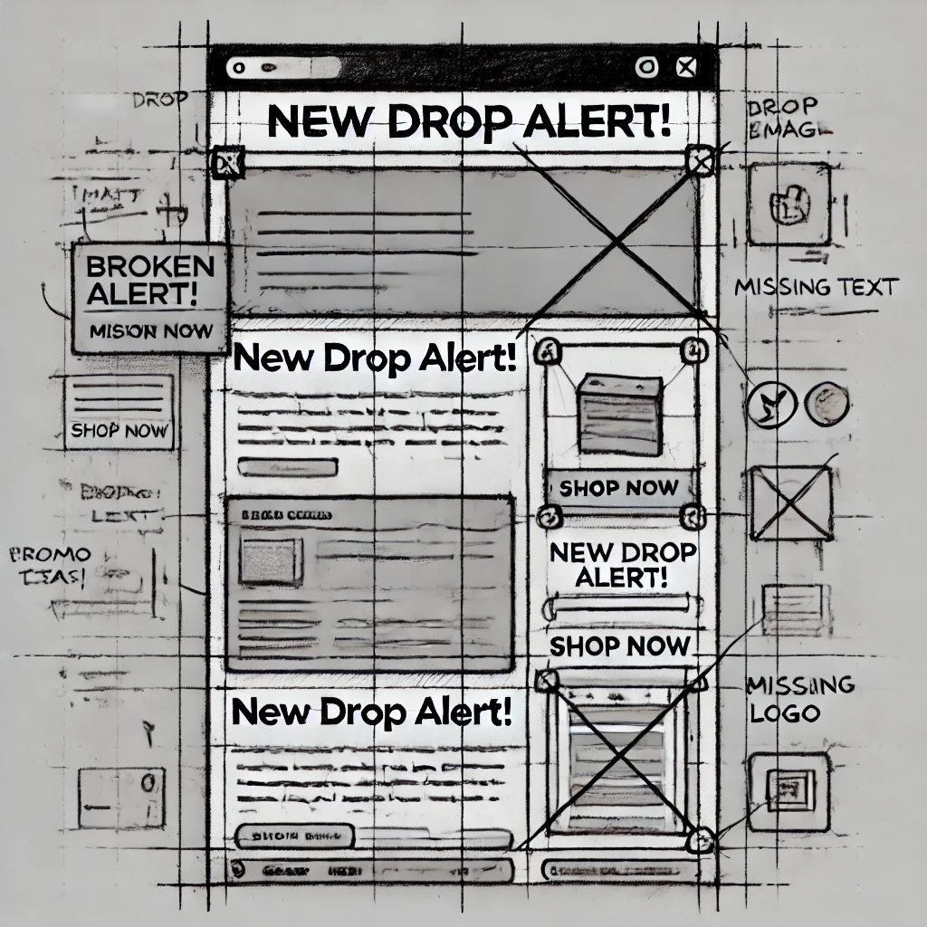
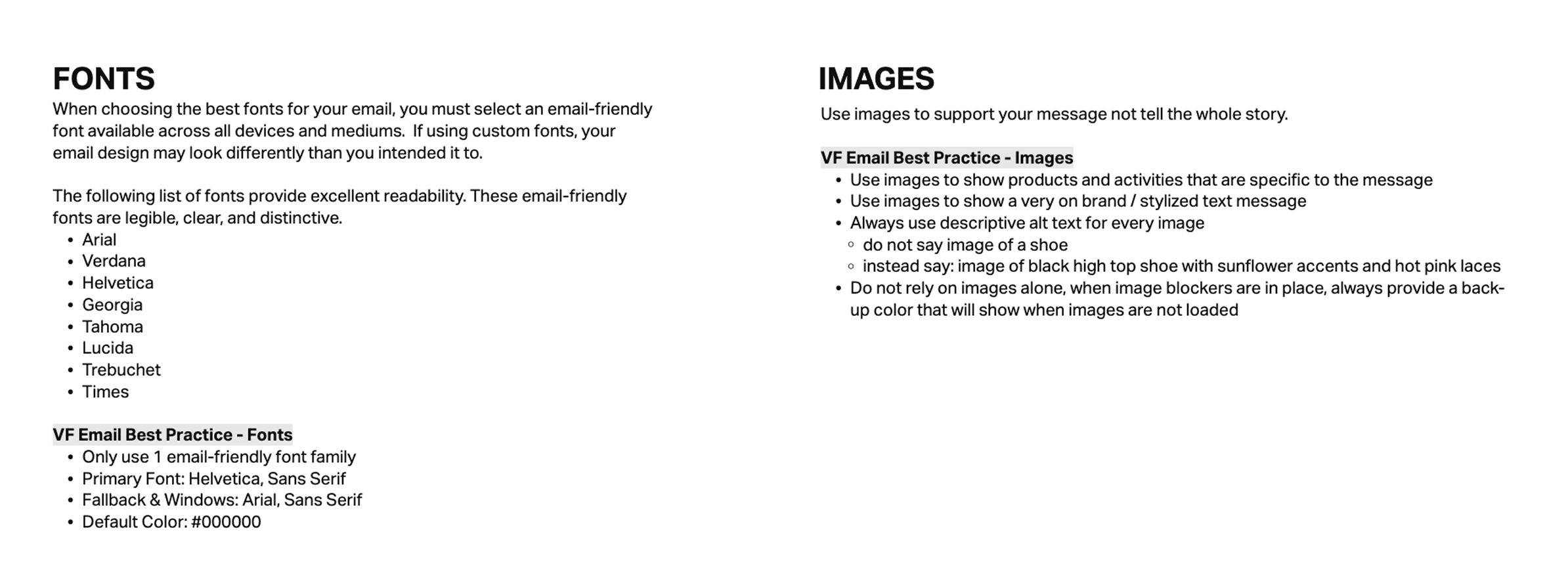
Vans’ marketing emails weren’t performing—and it wasn’t just a design issue. The metrics team surfaced low engagement rates, and on closer inspection, we found deeper problems: full-image emails (including image-based CTAs), no alt text, and inaccessible fonts. From a usability standpoint, it was broken. From a brand standpoint, it felt generic—nowhere near Vans’ bold, energetic voice.
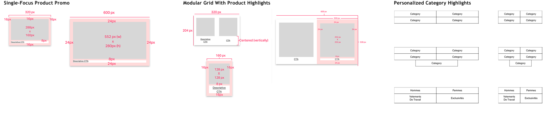
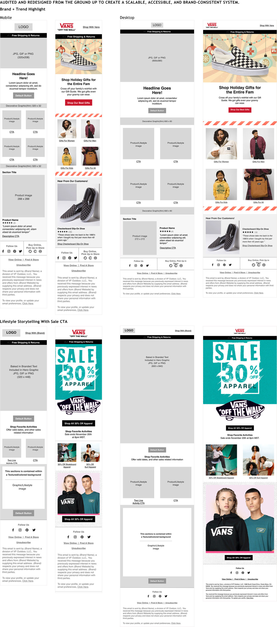
I was brought in to build a modular, accessible, and brand-forward design system for email from scratch. There was no previous framework—just outdated templates—and this was the first initiative to formalize and scale email design across campaigns.

Discovery & Research

My audit and research phase included:

  • Competitive analysis of high-performing brands in the space, revealing common standards: live text CTAs, succinct subject lines, mobile-first design, and full alt text support.
  • Generative testing showed users preferred personalized, clean emails that loaded quickly and weren’t image-heavy.
  • I also found that widths over 600px consistently broke across major email clients, impacting layout and readability.

Ideation & System Strategy

I proposed a 0→1 modular email design system, focused on clarity, consistency, and flexibility. The system would allow for creative freedom while ensuring performance, accessibility, and branding guardrails.

Key design decisions included:

  • A 1–2 column grid system to support both promotional and editorial-style content.
  • Background image support for campaign graphics while maintaining accessibility via live-text overlays and alt-tagged product images.
  • Eight flexible templates for primary, secondary, and tertiary messaging—built to scale across promos, rewards, reviews, and personalized product recommendations.

Prototyping & Validation

I worked closely with the email marketing team and developers using Salesforce Marketing Cloud, ensuring every component was implementation-ready and tested across major email clients.

  • Typography: Selected email-safe fonts—Helvetica with Arial fallback—and built a scalable type system for headlines, body, CTAs, and links.
  • CTA buttons: Redesigned with high-contrast brand colors, fixed height of 42px, and 16px padding, optimized for mobile tap targets.
  • Headers and footers: Stripped out top nav clutter to reduce cognitive load. New versions surfaced only essential links and messaging.
  • Visuals: Integrated Vans’ checkerboard motif and sample holiday skins to retain brand personality within accessibility boundaries.

Build & Launch

Over 3 months, I built the system in Figma as a reusable component library with clear documentation. We launched it across Vans’ seasonal campaigns first, then shared it across the broader brand portfolio.


Results & Impact

  • 100% of CTAs became screen-reader accessible
  • Email rendering issues dropped significantly across clients like Gmail and Outlook
  • Campaign production time decreased by 30%, as teams used systemized templates instead of starting from scratch
  • The design system was later adopted by Timberland and Smartwool, extending its ROI across brands

Reflections

This was a true 0→1 product design challenge—starting with a broken system and building a scalable, brand-aligned solution from the ground up. It taught me how to strike a balance between design creativity and implementation feasibility, and how modular systems can drive both efficiency and consistency at scale.

More From Design Systems