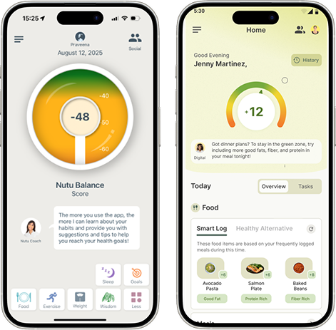
Diabetes Prevention Mobile App

Skills Applied

Design | Research | Stakeholder Alignment

Softwares Used

Figma | FigJam

User/Consumer Base

B2C

Industry Experience

Digital Health | Chronic Condition Prevention | Healthcare UX

What is Nutu?

Nutu is a digital health app that helps people build healthier habits and manage risks like prediabetes. It combines:

  • Daily Logging (food, sleep, exercise)
  • Personalized Training
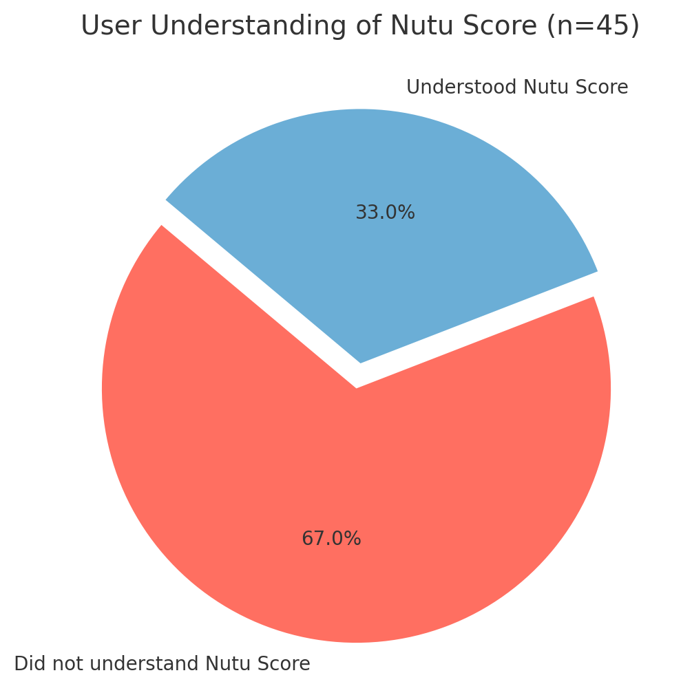
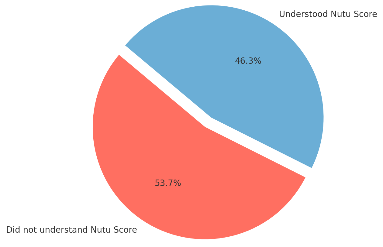
  • The Nutu Score (shows how food, exercise and sleep impact health).
  • Device Syncing (Apple/Android Health).
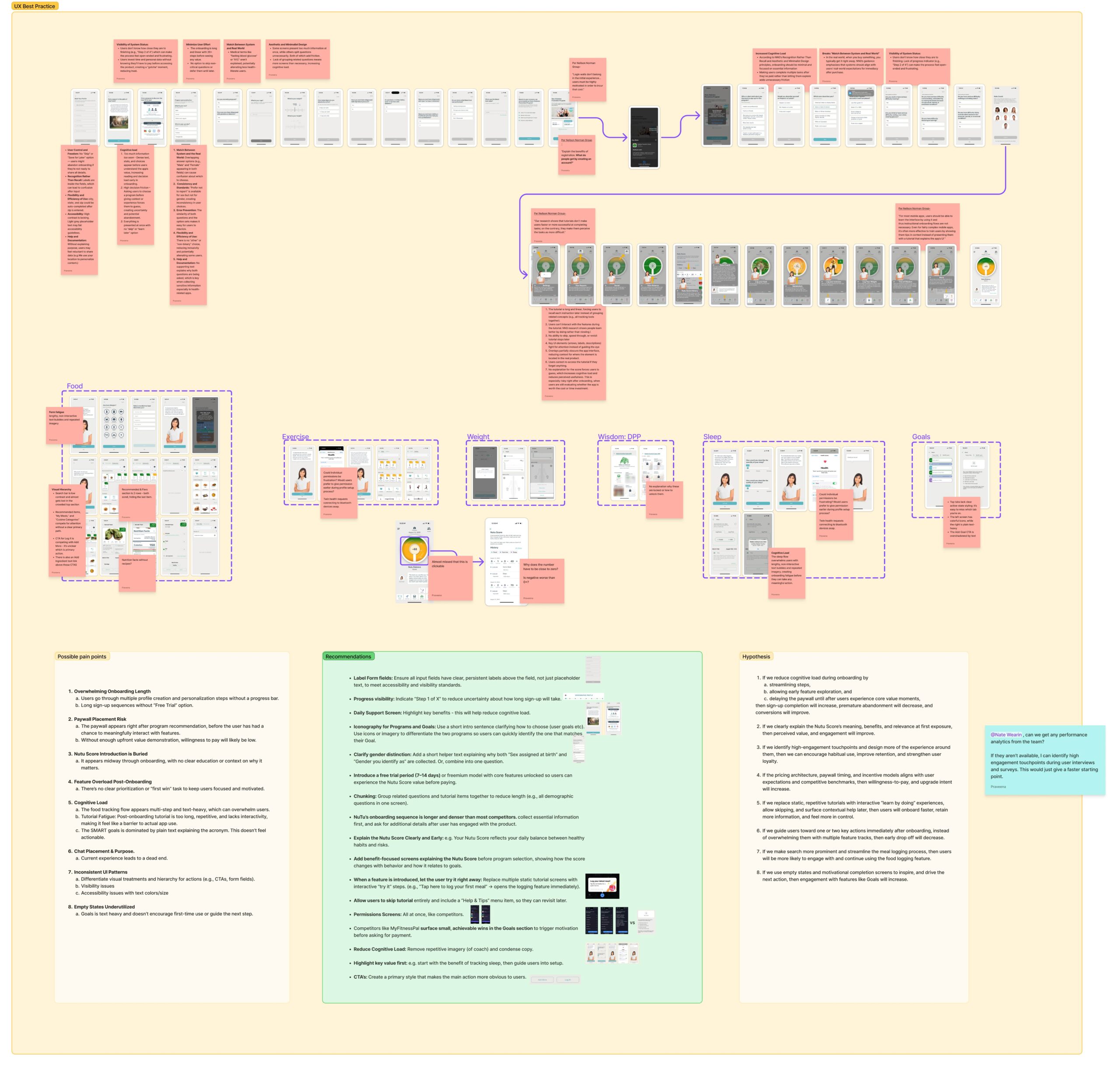
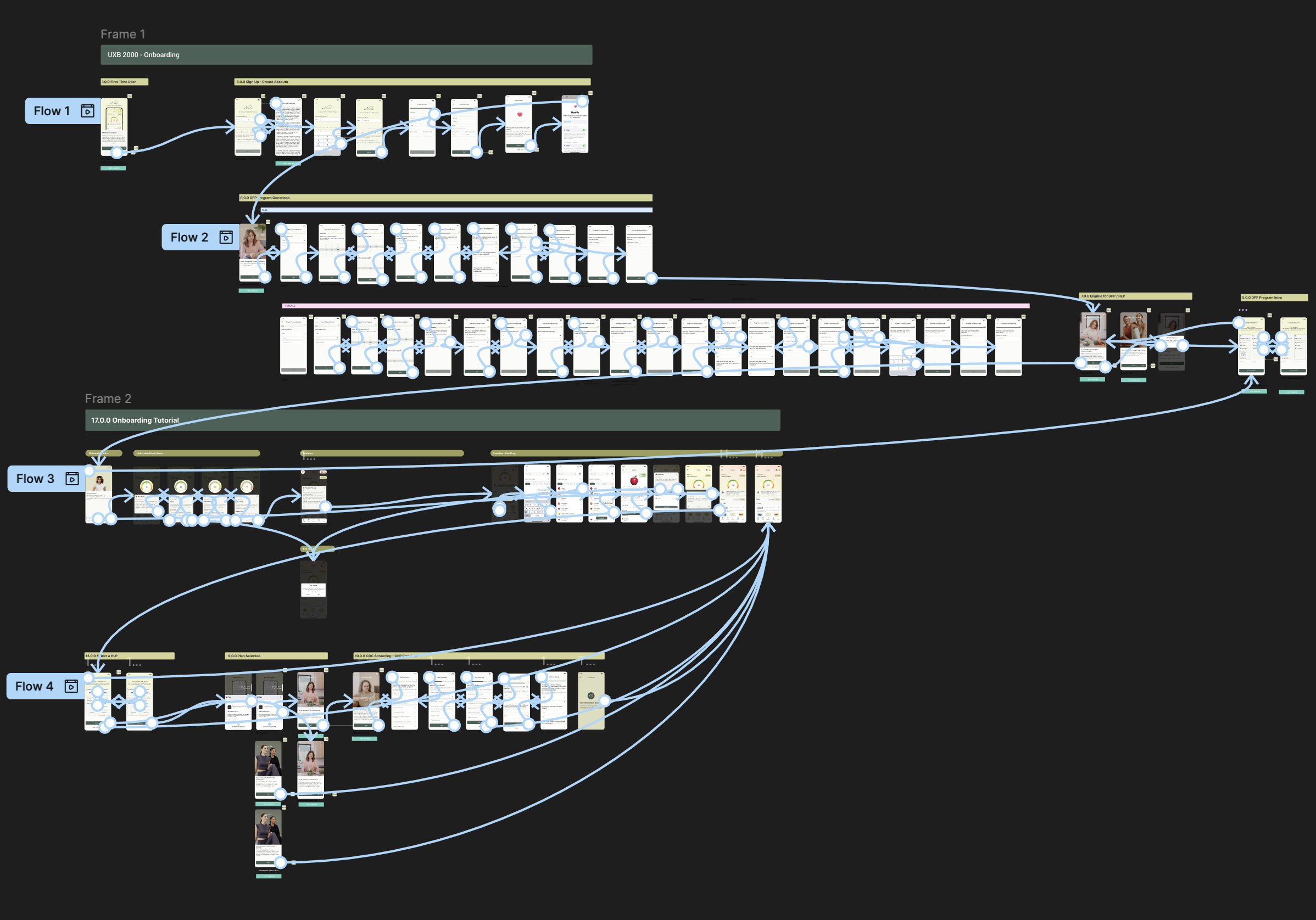
 

What I Did

• Heuristic evaluation of NuTu and competitors

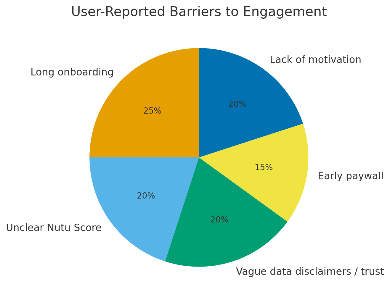
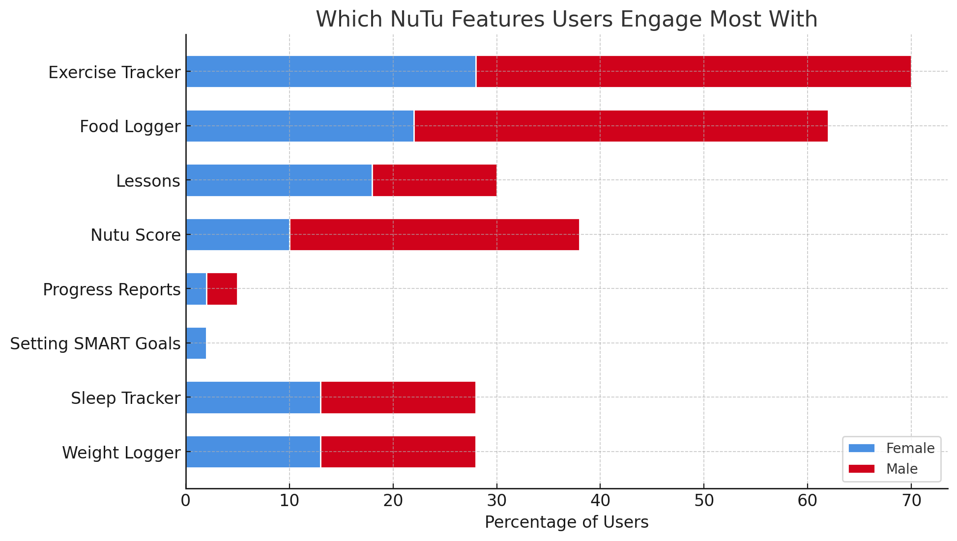
• Surveys and interviews to uncover friction

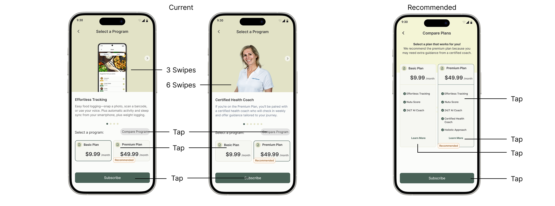
• Actionable recommendations to high-fidelity prototypes

• Collaboration with stakeholders, designer, and developer

• Presentation deck with insights and design roadmap

The Problem

NuTu’s onboarding was long and complex, confusing users about data use and discouraging them with early paywalls. Participation in the CDC’s National Diabetes Prevention Program (National DPP) required an eligibility screener, adding another step that increased drop-off. Together, these barriers caused many users to abandon the app in their first sessions, making retention difficult.

Approach

To understand where Nutu’s experience was working and where it was breaking down, I used a mixed-method approach:

  • Heuristic Evaluation & UX Audit
    I evaluated both old and new Nutu designs against Nielsen Norman Group’s heuristics to identify usability issues, accessibility gaps, and sources of cognitive load.
  • Competitive Analysis
    I compared Nutu to direct competitors in the diabetes prevention and healthy living space, analyzing how others handle onboarding, paywalls, personalization, and motivation strategies.
  • Surveys
    I launched surveys to quantify user perceptions, focusing on awareness of the Nutu Score, definitions of healthy living, feature preferences, and pricing sensitivity.
  • Moderated Interviews
    I conducted 1:1 interviews to validate survey findings and dig deeper into users’ mental models, motivations, and trust concerns around health data.

This layered approach ensured I could triangulate findings, capturing both breadth (survey scale) and depth (interview insights) while grounding design recommendations in competitive and heuristic evidence.

.

User Insights at a Glance

From research, several consistent barriers to engagement emerged (see chart). These findings highlighted the biggest obstacles for users, which informed our design recommendations.

  • 67% of users didn’t immediately understand the Nutu Score’s benefit
  • 48% wanted integrations with Fitbit or Garmin, and 20% with smart scales
  • 17% of users reported stopping use entirely due to friction (buggy logging, confusing flows, lack of integration)
  • Exercise Tracker (47%) and Food Logger (46%) were the most used features, followed by Nutu Score (33%) and Weight Logger (37%).
  • Many users found the Nutu Score confusing or forgettable without clear, ongoing explanation.
  • Long tutorials felt repetitive, leading users to skip content rather than absorb it.
  • Trust issues surfaced around vague data use disclaimers and the “AI Coach,” which felt misleading when paired with stock photos.
  • Users preferred free trials before paying, with most valuing the app closer to $9.99–$29.99/month.

Overall, users expressed concern over trusting the app with health-related decisions. They required clinical credibility and reassurance, reflecting the importance of evidence-based design in healthcare.

Design Recommendations

• Simplify onboarding: Fewer steps, clearer sequencing, show value sooner, and fit in the CDC’s National DPP screener with minimal friction.

Be transparent: Clear data-use messaging and “skip for now” options.

Motivate early: Use engaging visuals, animations, and quick wins.

Clarify the Nutu Score: Explain upfront and make it actionable.

Enable integrations: Sync with Fitbit, Garmin, and other devices.

Reduce interaction cost: Consolidate repetitive swiping/tapping into single, clear screens to lower user effort when making key decisions.

Prototyping

After identifying key friction points and developing recommendations, I translated the insights into high-fidelity mockups and clickable prototype flows. The prototypes focused on:

Streamlined Onboarding: Reduced steps with consolidated screens, clearer sequencing, and early value demonstration.

Plan Comparison: A single screen showing plan benefits side by side, reducing interaction cost and decision fatigue.

Motivation & Feedback: More engaging visuals and progress cues to reinforce daily wins.

Trust & Transparency: Revised data-request flows with clear explanations and “skip for now” options.

Habit Support: Features tied to long-term engagement, with integrations to devices like Fitbit and Garmin.

These prototypes were presented to stakeholders as concrete, testable solutions, bridging research findings with actionable design direction.

Outcomes & Next Steps

Research Insights

The research uncovered where Nutu’s experience was breaking down — long onboarding, vague data disclaimers, low motivation, and unclear Nutu Score messaging. Surveys also showed users wanted stronger integration with their existing health devices, reinforcing the need for credibility and daily relevance.

Design Solutions

I translated these insights into prototypes that streamlined onboarding, reduced interaction cost, and consolidated plan comparisons. I also added clear data-use messaging with “skip for now” options, introduced more engaging visuals and progress cues, and reframed the Nutu Score so users could quickly understand its value.

Future Directions

The next step is to validate these prototypes through usability testing and iterate further. Building integrations with wearables and lab data will be critical for at-risk users, while refining habit-support features will help sustain long-term engagement and reduce the risk of churn.