Independence Assessment Dashboard

Skills Applied

UI Design | UX Research | UXUAT | PI Planning

Softwares Used

Adobe XD | Invision | Balsamiq | DevOps

User Base

Auditors

Industry Experience

Fintech | Enterprise

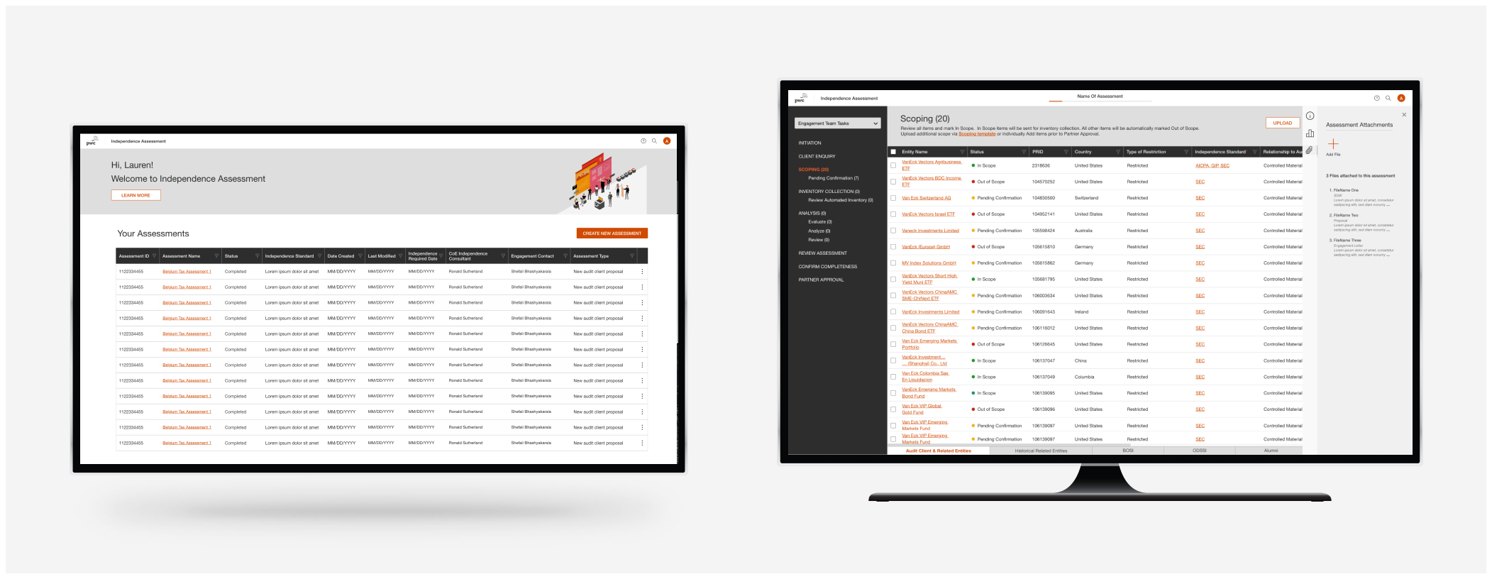
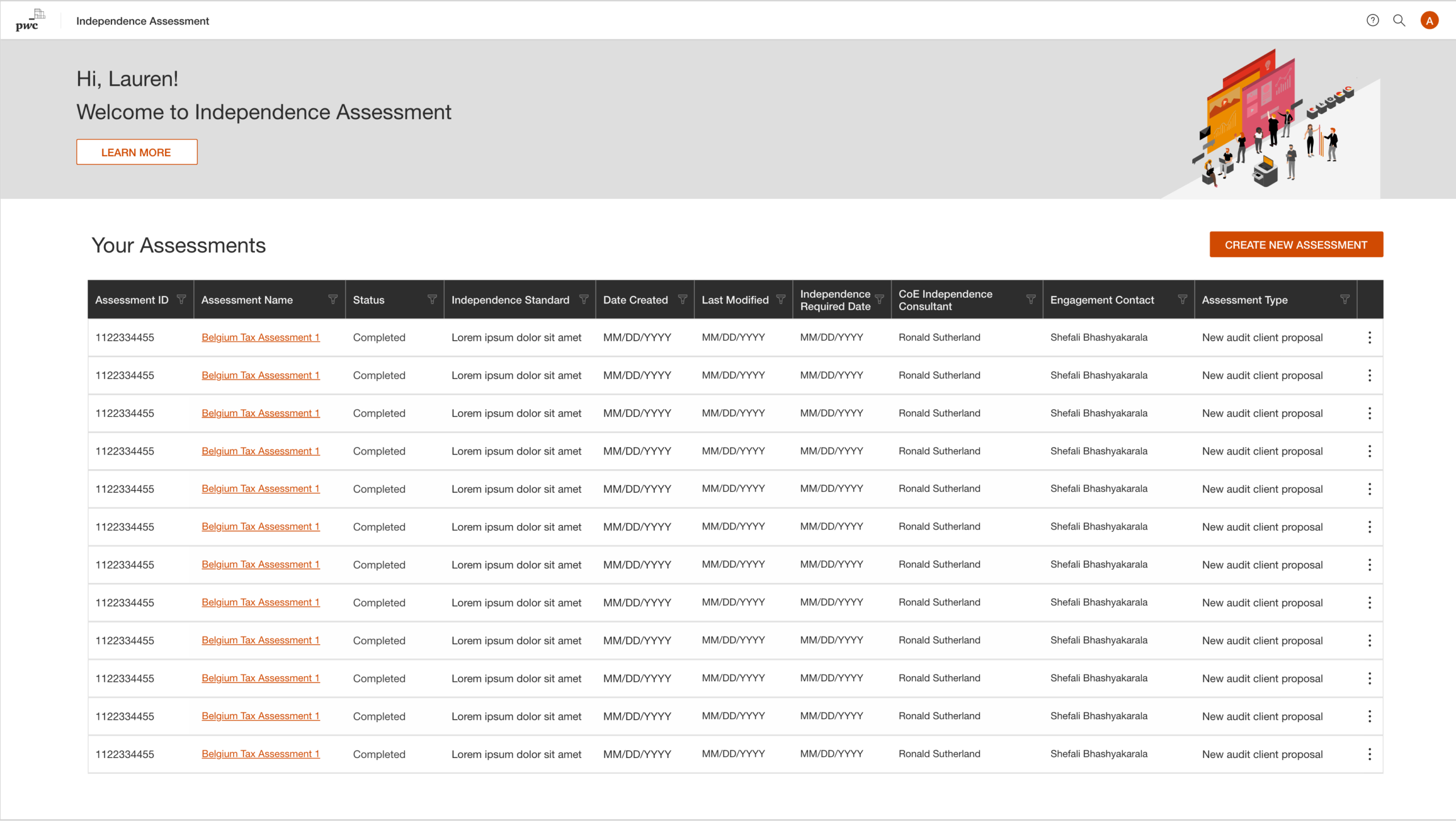
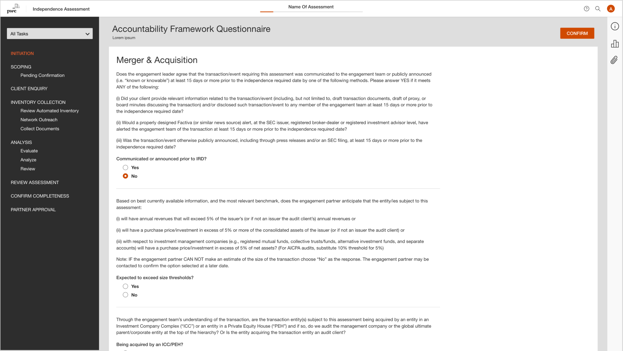
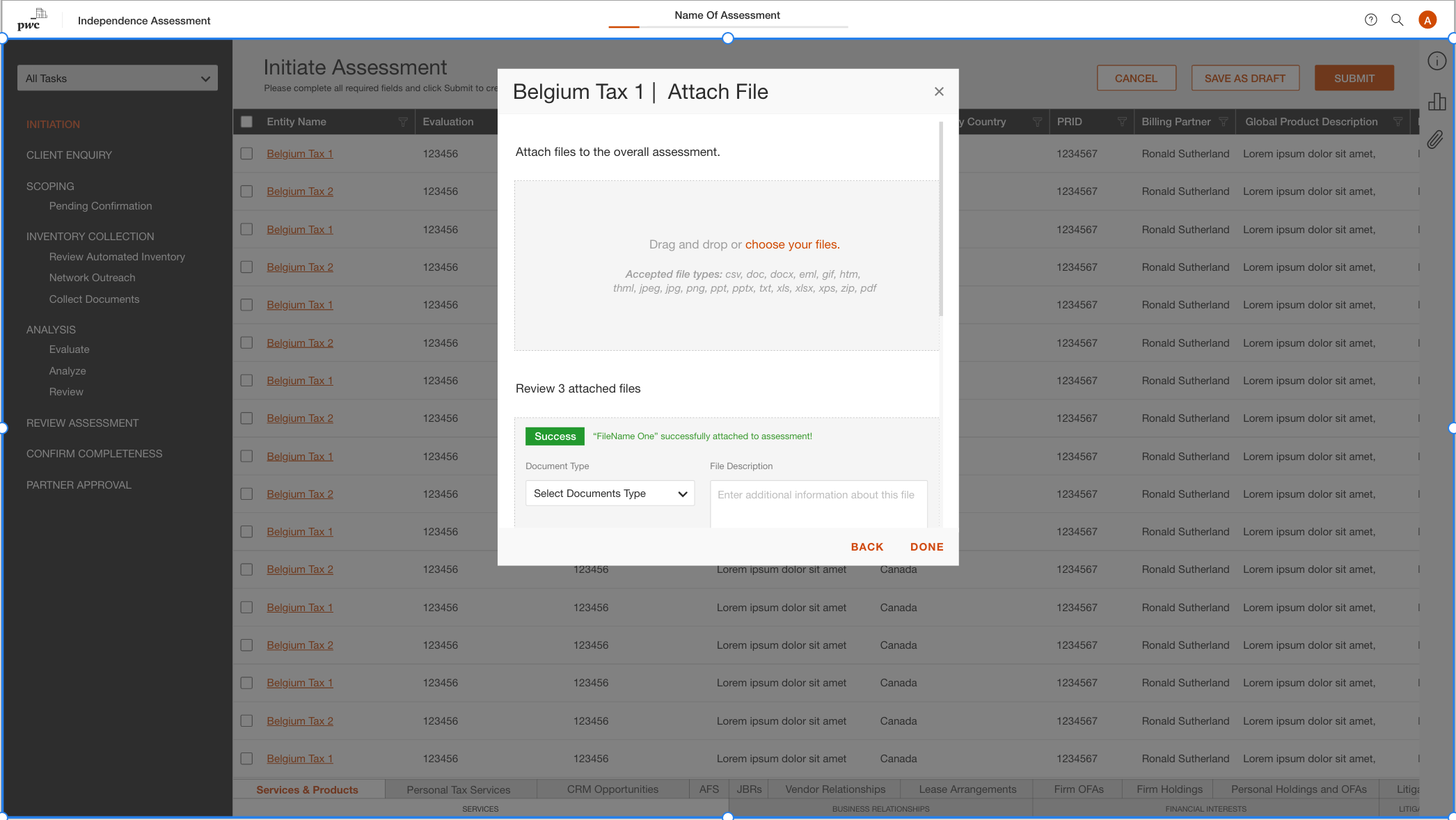
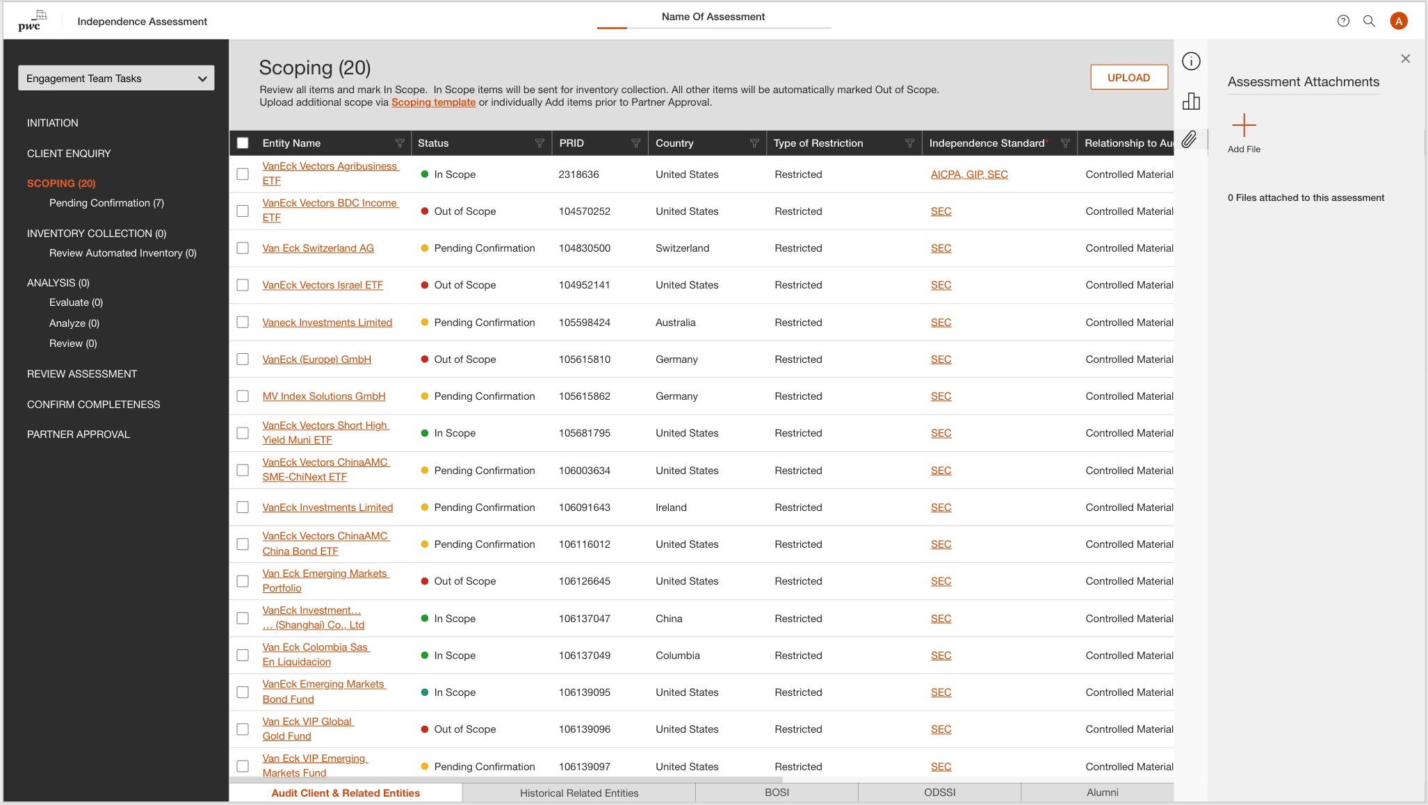
Independence Assessment Web Tool

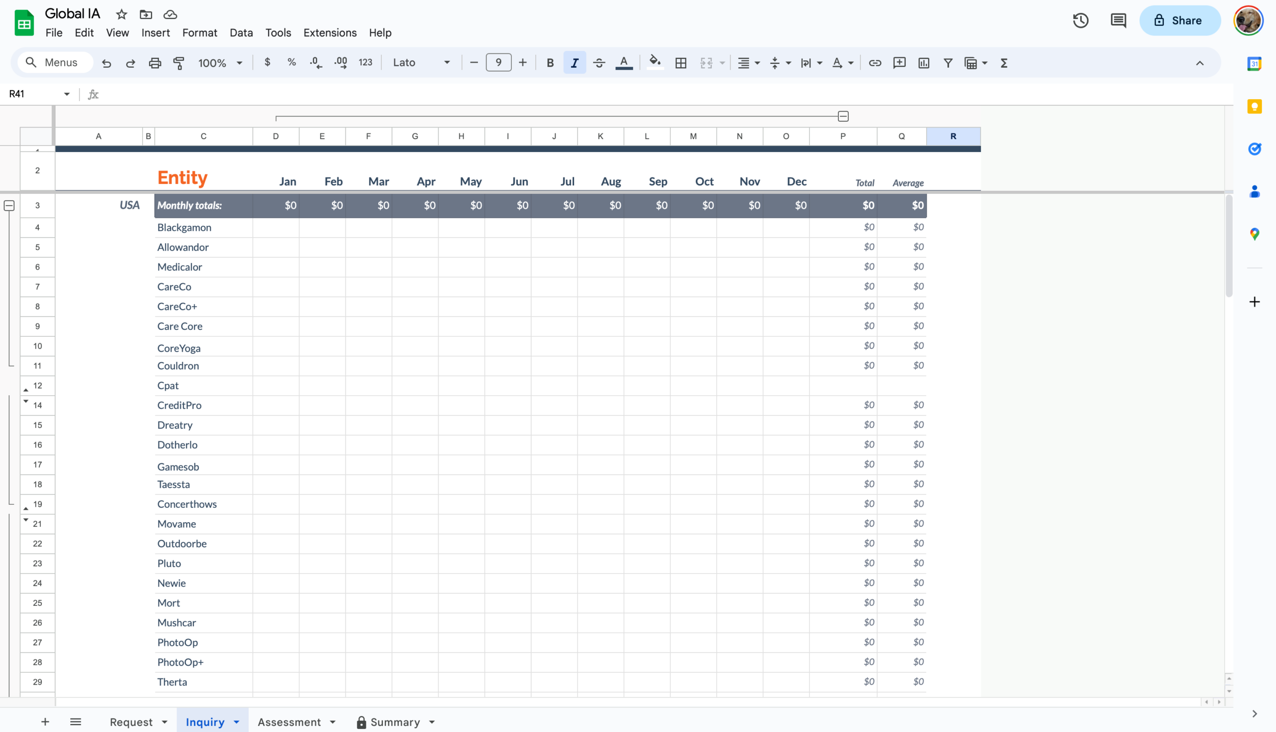
At PwC, auditors must complete independence assessments before working with clients. These conflict-of-interest checks confirm that auditors, and others on their team have no financial or personal ties to the company being audited. This process was previously managed through large spreadsheets, which caused delays, inconsistencies, and compliance risks.

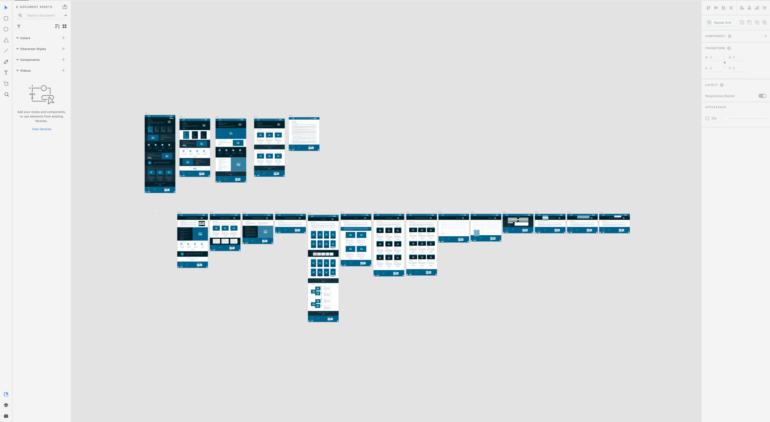
I was engaged as a contract UX designer to step in during a transition and led the effort to replace this fragile system with a secure, intuitive web tool. My role covered the full product design cycle, from leading discovery workshops with auditors in New York to creating wireframes in Balsamiq to delivering role-based workflows with developers and QA.


Problem

Auditors relied on complex spreadsheets to complete independence assessments (conflict-of-interest checks). The process created delays, inconsistencies, and compliance risks.

My Role

Contract UX Designer brought in during a transition. Owned the project end-to-end, from research to delivery.

Solution

A secure, intuitive, scalable web tool that streamlined the independence assessment workflow and required no training for global adoption.

Impact

• Reduced compliance risks by replacing spreadsheets

• Simplified auditor workflows and improved consistency

• Delivered a tool scalable across regions with Salesforce integration

1. UX workshops in New York
2. Task Based Prototype testing
3. Dashboard & workflow design
4. Dev + QA collaboration

Enterprise UX demands tools that are not only usable but scalable, auditable, and maintainable. I focused on long-term usability by building features that adhered to best practices in accessibility, security, and cross-role compatibility.

Dashboard Design with Clarity, Not Clutter

Good dashboards are more than tables—they are decision-making tools. I applied key dashboard design principles to make the interface work at-a-glance:

Task-based grouping instead of module-based organization

Dynamic field locking to avoid accidental edits mid-review

Color-coded validation states to guide user flow

Adaptive layout for large monitors, commonly used by enterprise auditors

Following guidance from NN/g, I avoided overwhelming users with too much data by designing for relevance and flow.

From 0→1: My UX Design Process

1. Research & Framing

  • Conducted stakeholder interviews and user task analysis to understand audit workflows and constraints.
  • Translated findings into requirements, personas, and UX goals.
  • Created an agnostic journey map.

2. Low-Fidelity Prototyping

  • Created early concepts in Balsamiq, which allowed rapid feedback and iteration.
  • Focused on information hierarchy, not polish—consistent with NN/g’s recommendation to test structure before styling.

3. High-Fidelity UI & Interactive Testing

  • Built interactive prototypes using InVision and tested flows with real users across different audit teams.
  • Incorporated industry best practices for dashboards, including:
  • Progressive disclosure for complex actions
  • Visual hierarchy optimized for at-a-glance scanning
  • Real-time validation for data entry fields


4. User Acceptance Testing & Launch

  • Ran UX-focused UAT in the QU (quality + user testing) environment alongside QA.
  • Adjusted flows and components based on user feedback before final handoff and go-live.

Collaboration, Iteration, Delivery

As the sole UX designer, I worked in two-week sprints using Azure DevOps, aligned closely with developers and a QA lead. Every screen or feature was reviewed for feasibility, then tested and adjusted pre-launch. I conducted post-launch evaluations with field users to capture feedback for V2.

Iteration Documentation

Each wireframe, user flow, and component design was versioned and annotated directly in Balsamiq, serving as a living documentation system for both developers and stakeholders. These documents were used to:

• Track decision rationale

• Share updates during sprint reviews

• Provide QA with testable interaction specs

Why it worked: Tight UX/Dev alignment and fast iteration allowed us to ship reliably, while staying flexible enough to pivot based on what auditors actually needed.

Welcome Screen

Welcome Screen

What agents see after they login in.

Assessment Initiation

Assessment Initiation

The assessment initiation process begins with agents filling & submitting the form on this screen.

Add File

Add File

The modal popup users see when migrating existing entity data into our new platform.

Scoping

Scoping

Agents assess the scope of inventory collections before sending for partner approval. They select in-scope items on this screen.

Add Scope

Add Scope

In case of missing scope items, user can add new scopes by clicking 'Add New' from the Attach section of the right panel.

Project Management Capability

Project Management Capability

Before marking as complete, teams must perform, review & report their Entity analysis. All status updates and errors are marked in green, yellow, red or black text with tagging & commenting capabilities to ensure resolution prior to documentation.

Results & Enterprise Impact

40% decrease in auditor delay time

30% improvement in data accuracy

Zero training required post-launch due to intuitive UI

• Rollout extended from a regional pilot to national use within one quarter

This tool didn’t just replace a spreadsheet—it improved compliance, speed, and user satisfaction across departments.

Accessibility, Localization, and Security

From the start, the dashboard was designed with global scalability and enterprise compliance in mind. Key decisions included:

WCAG-compliant color contrast and font sizing

Built-in localization flexibility (designed labels and inputs to accommodate translation lengths)

Role-based access control with editable and locked fields based on user type

Audit logs for every data entry or status change to ensure traceability

These design choices were modeled on compliance expectations used by firms like PwC, where data integrity and review traceability are essential.

This new tool gives me confidence that I haven’t missed a step. The validation checks make it hard to submit incomplete assessments, and the layout mirrors how we actually conduct the independence check in the field.

Senior Auditor, after pilot launch